
Beginners Tutorial: Coloring with Spectrum Noir TriBlend Alcohol Markers
Another crafting technique I learned in 2020 is coloring with alcohol markers. Wow is it fun! Smooth blending to add dimension to stamped images that can coordinate with patterned papers – making a beautiful card topper.
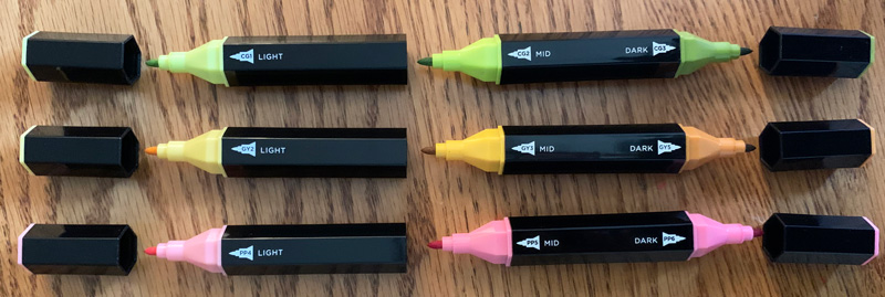
Last year I purchased a small set of TriBlend Markers by Spectrum Noir. These are great for coloring beginners like me because they have three color shades in one marker – light, medium, dark – for a super simple way to add 3D shading to any stamp. It takes adult coloring to the next level. After completing each little item, I’m wowed by the results every time!
I certainly don’t profess to be an expert, but here’s a quick tutorial about how I use the TriBlend Markers to make a statement on any card:
First tip: don’t take the coloring too seriously. Obviously my colored sample here is not perfect, but I think the overall look works well. I’m literally just drawing on the color here and there, trying to keep in the lines, just keeping relaxed.
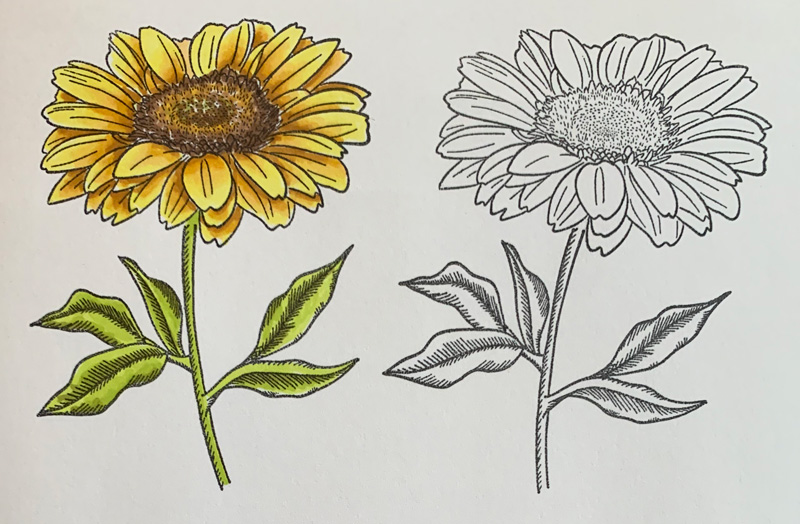
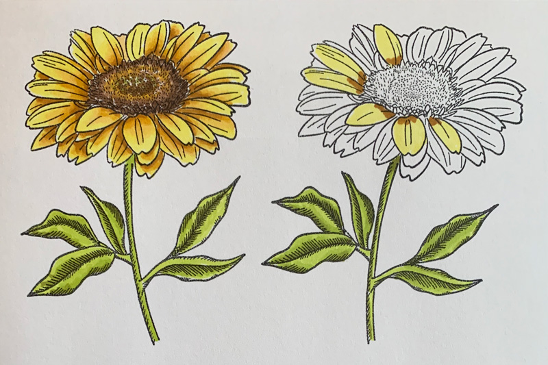
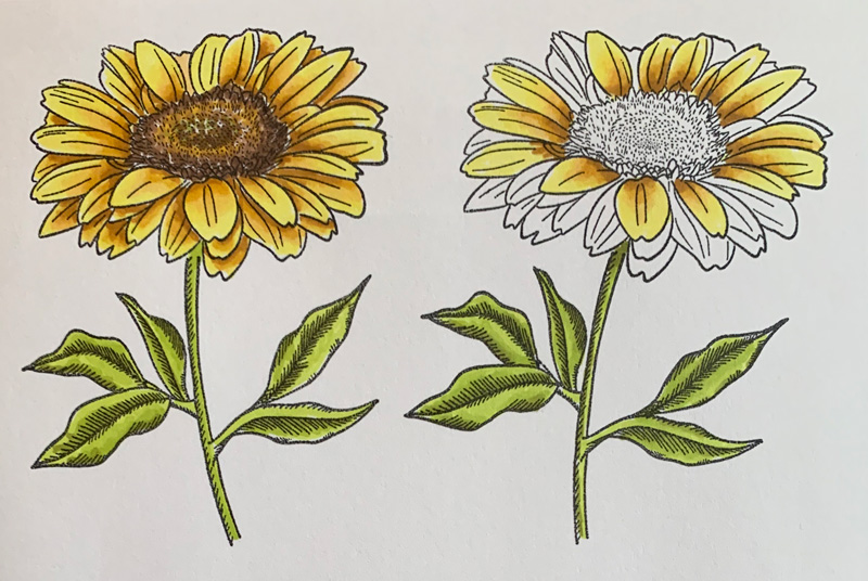
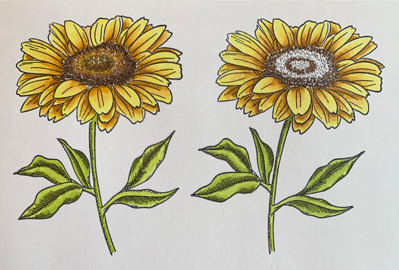
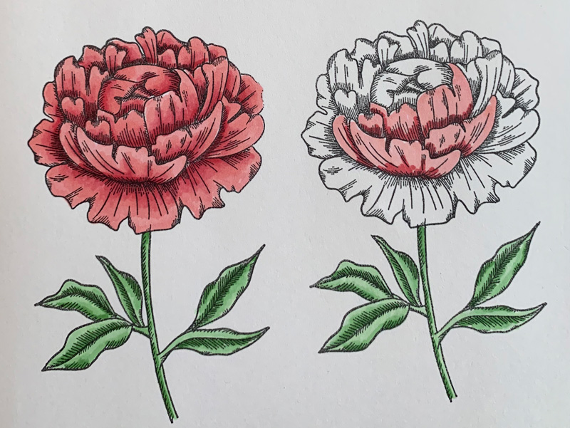
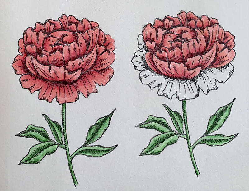
Second tip: start with a stamp that already has a dimensional look to it. And an extra bonus is using one with little shading lines that you can use as a guide!
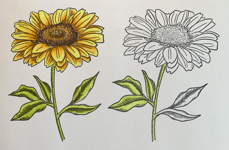
Next, coloring small sections at a time, color the whole area with the lightest color. The reason to focus on small sections at a time is so you’re blending the colors while it’s still wet.
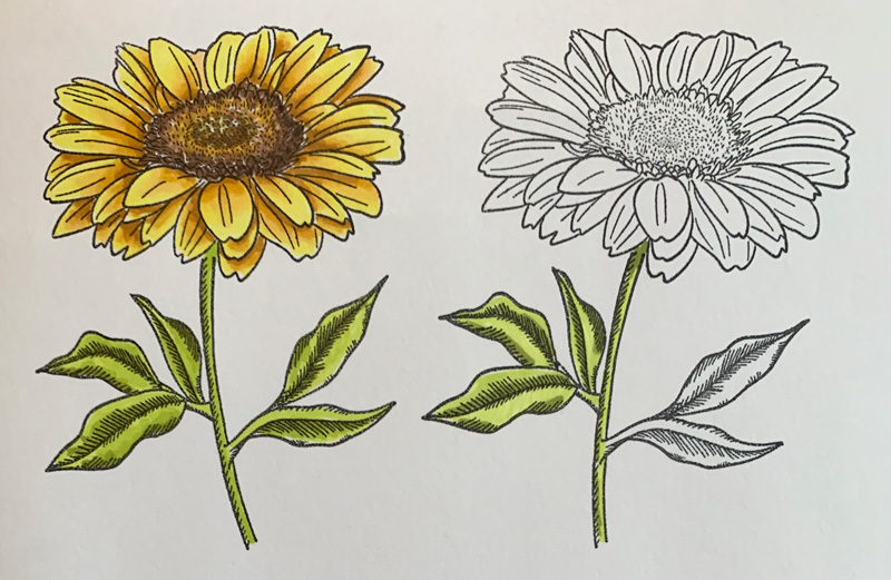
Add the darkest shade to the areas that you think would be the darkest. On this sample, the lines help show the areas that should be darker, but another tip is anywhere that is under another overlapping area, such as the top of the stem here.
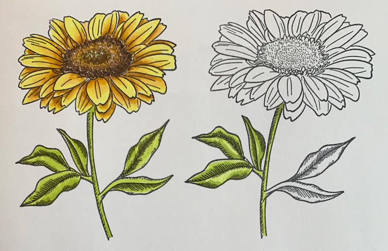
Then add in the medium shade, overlapping the darkest shade slightly and moving into the lightest shade. This step blends the dark into the medium. As you go, it may still look choppy, but as it dries, the transition smooths out.
Lastly, use the lightest shade again, overlapping the medium shade slightly and moving over the rest of the light area again. Tada! Dimension added! Then move on to the next section with the same colors – leaves in this sample – with the same process.
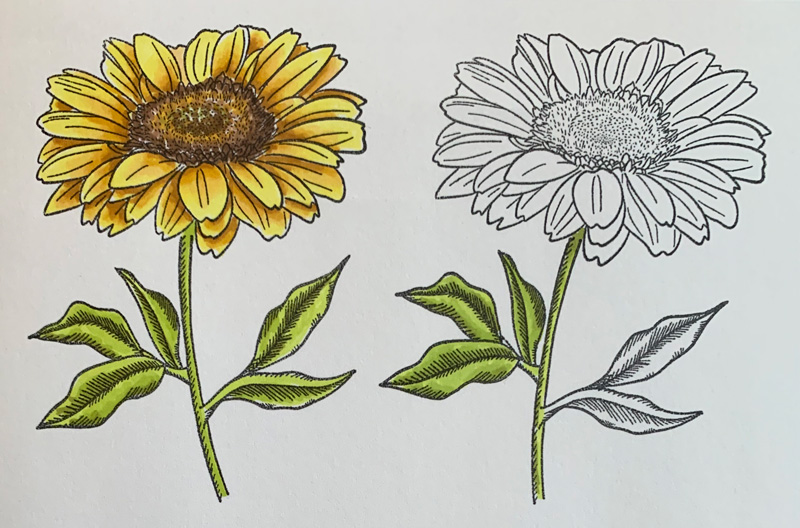
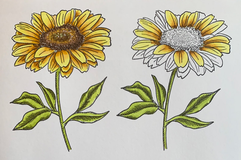
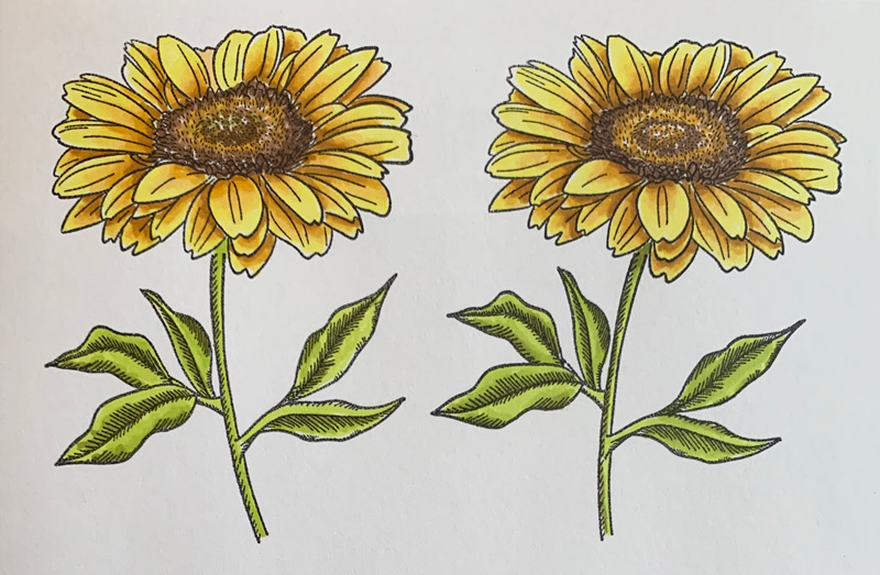
Next, I’ll show you blending with two different markers to add even more dimension. Again, start with the lightest color in a small section. This time I used yellow from one marker, then added the darker shades with a second marker in gold.
Here you can see I added the darkest shade from the gold marker. It looks bad right? Trust me it will work. Don’t be afraid – the bold leap adds more dimension!
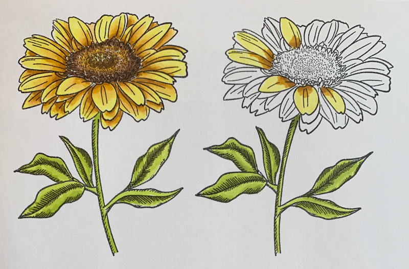
Next add the medium shade of the gold marker, overlapping the darkest shade slightly and moving into the lightest shade.
Then the light shade of the gold marker, overlapping the medium shade slightly and moving into the lightest shade.
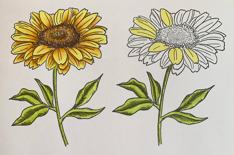
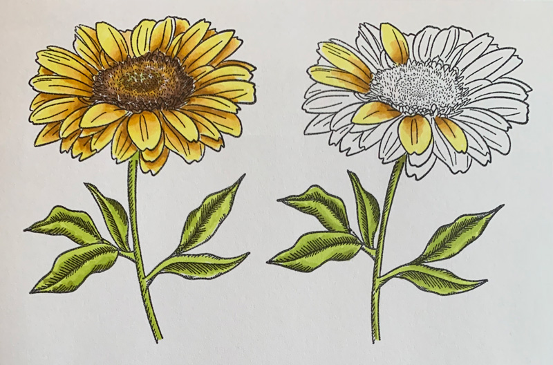
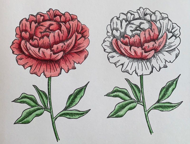
Another tip: for flowers, I keep the blending of the darker colors in the middle of the petals, so each petal keeps a little light edge to separate it from the ones underneath – you’ll see what I mean as I add the layers.
Lastly, add the yellow from the first marker, overlapping the lightest gold shade slightly and moving into the original light area.
Continue to move around to different areas with the same steps.
Bonus dimension tip: Go back again with the darkest color for an extra accent. It looks weird at first, but as it dries, it adds a little punch of shade that makes the lightest colors pop more.
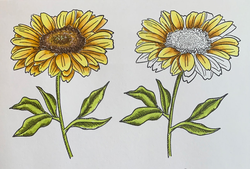
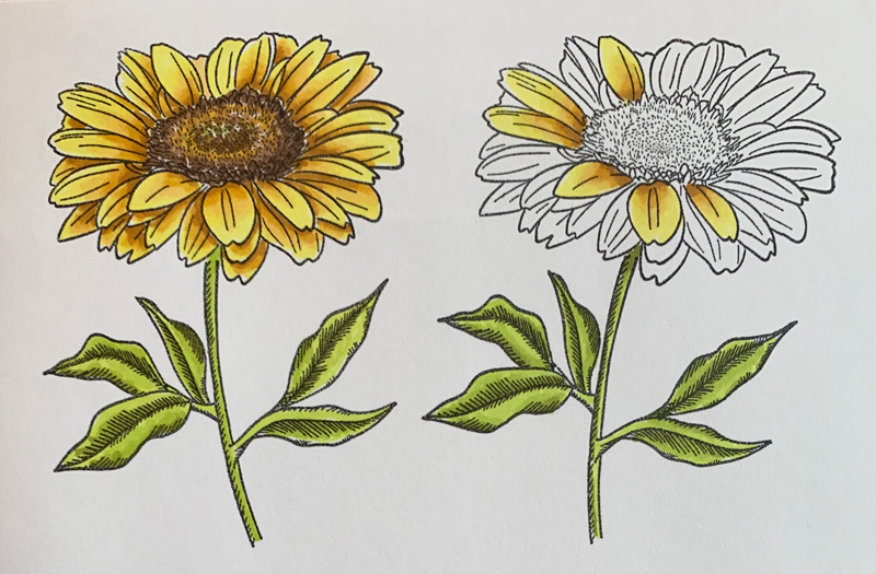
Then continue with the next layer of petals, using the same process, but adding a little more of the darker colors since they are underneath the top layer of petals. For the darkest shade, I “outline” the top layer of petals to help them pop more. This is why I kept the edges only in the light color on the top layer of petals.
Continue the same steps for all the petals until they are all colored.
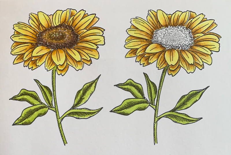
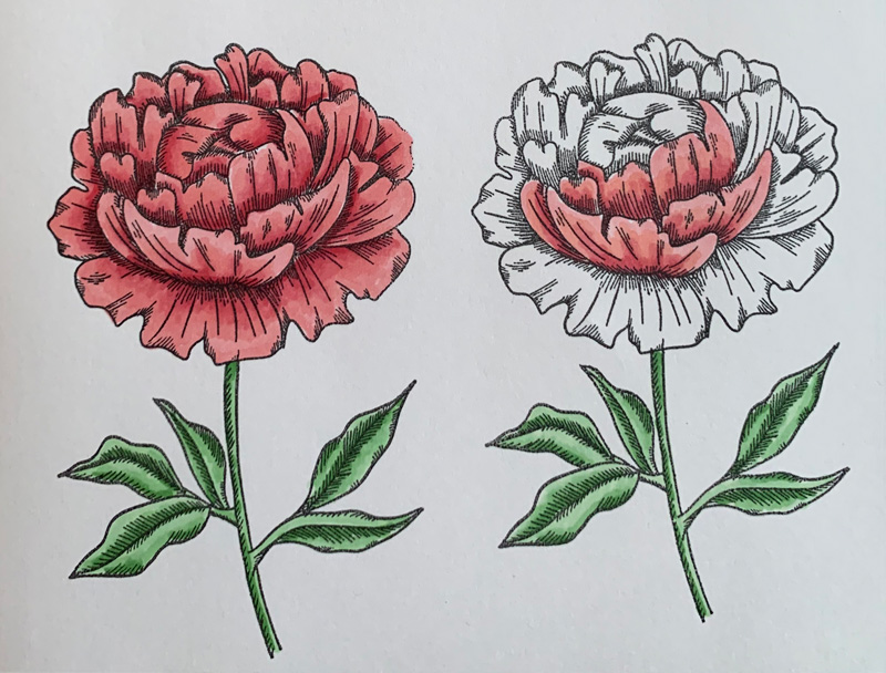
For the center, I used a brown marker and colored with little dots to add the texture of the little seeds and fuzz, starting with the darkest shade at the edges.
Then I moved into the center with the brown medium shade and also a little of the gold marker to coordinate with the coloring on the petals.
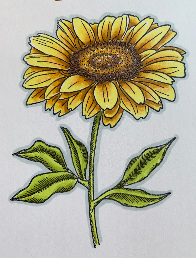
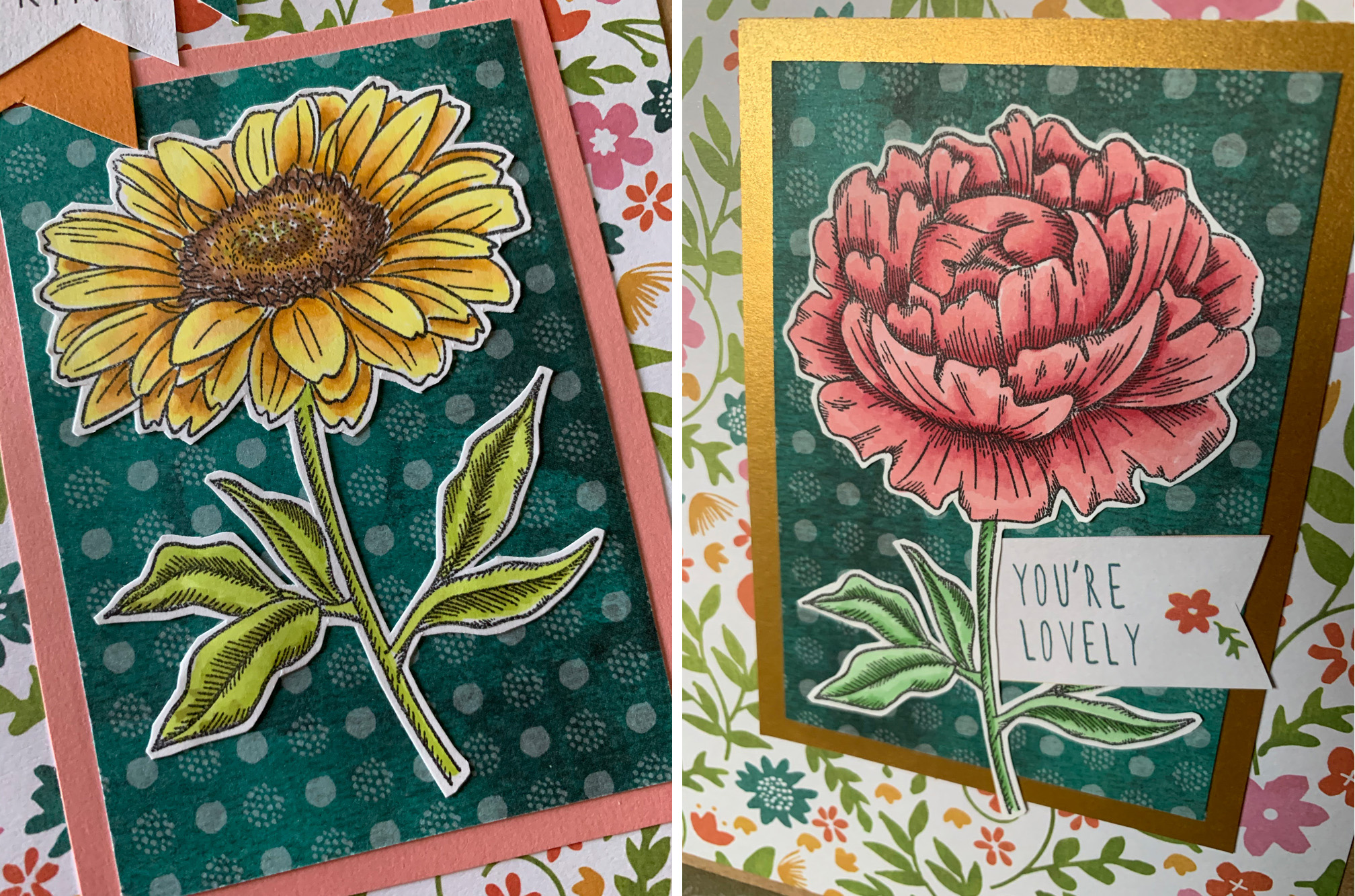
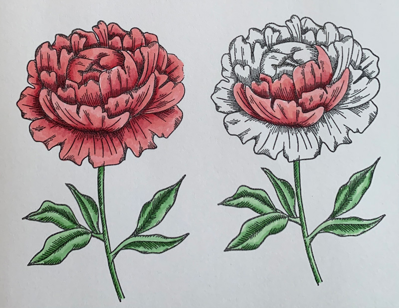
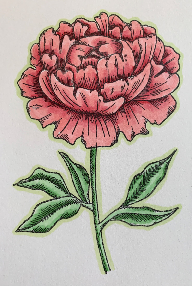
As a final step, outline the entire image in a light color. I used a light blue here to contrast with the yellow/gold – opposites on the color wheel. This added step takes away the stark edge of the stamp and it helps hide any little marks outside the lines. Wow – all ready to top a card.
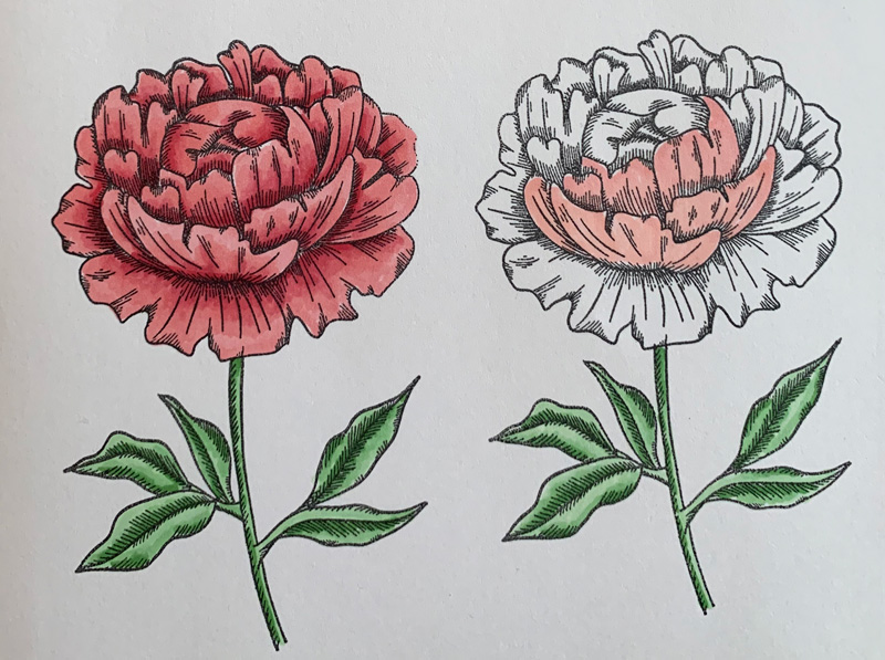
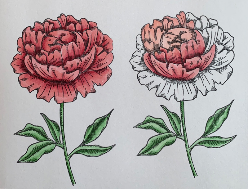
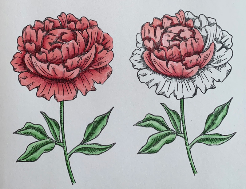
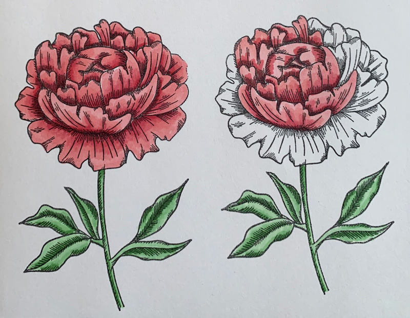
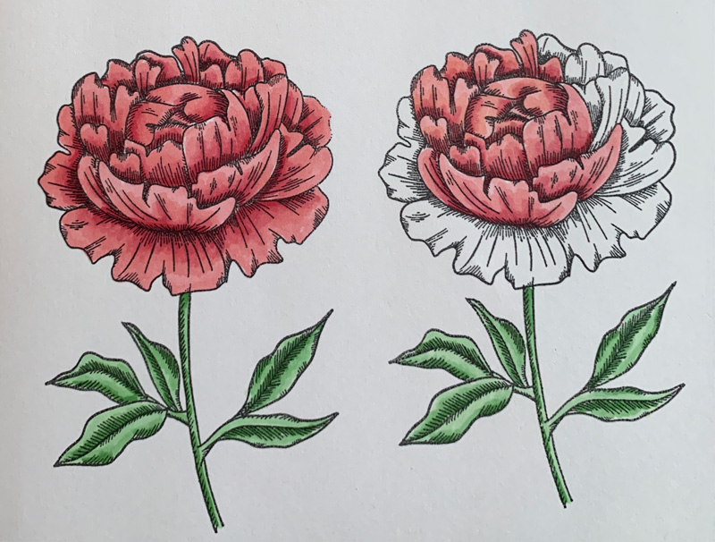
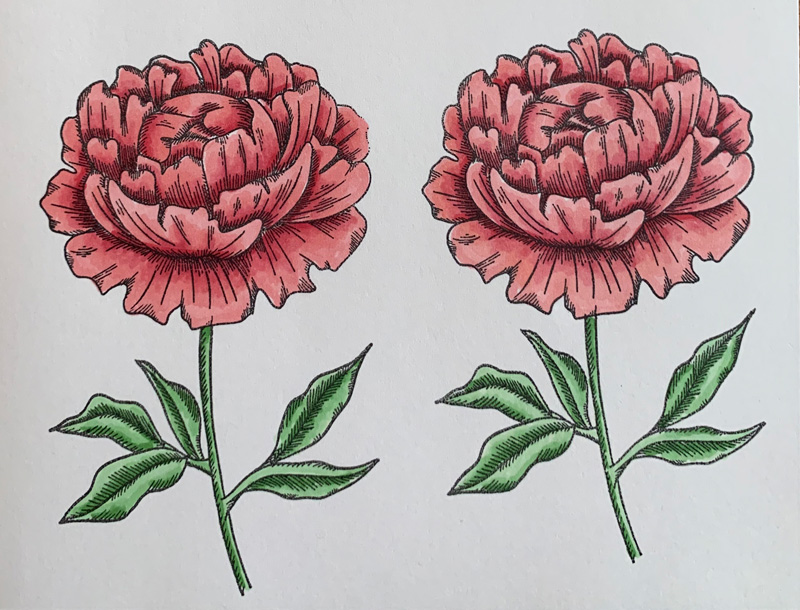
Here’s a second sample using the same process with different colors. A more of a mint green on the stem and leaves, and pink + a red marker for the flower.
In the last step here, I added the red line just along the darkest edge of the shading. It’s kind of subtle, but I think it helps the lightest pink edge of the top petals pop more.
I hope you found a few tips in my beginners tutorial and will try using these markers yourself. Enjoy!
Leave A Comment